Carter & Rye

Transforming a storefront through a complete window wrap
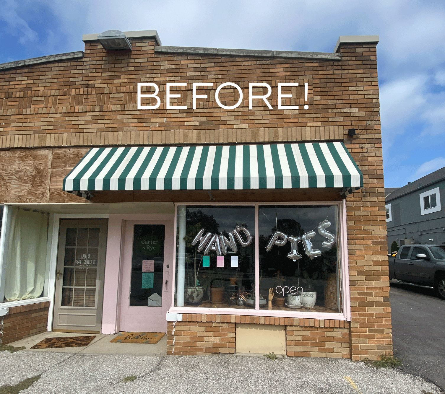
Project Overview
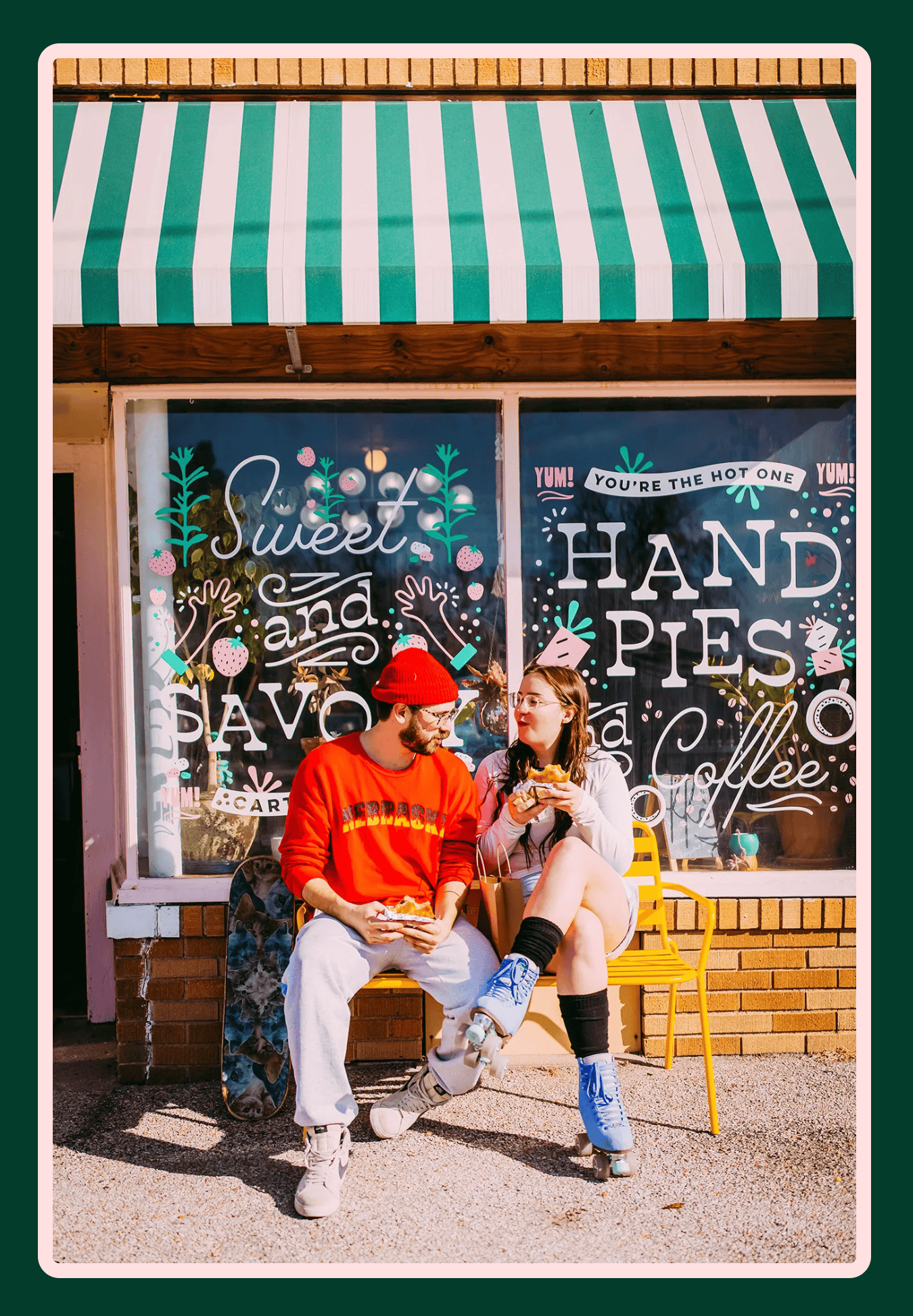
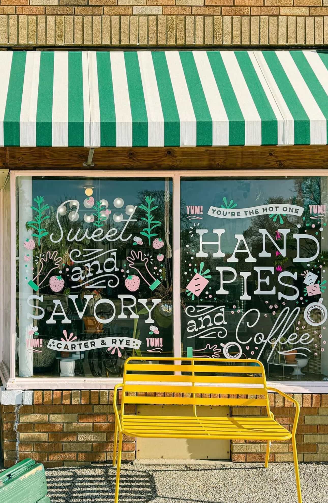
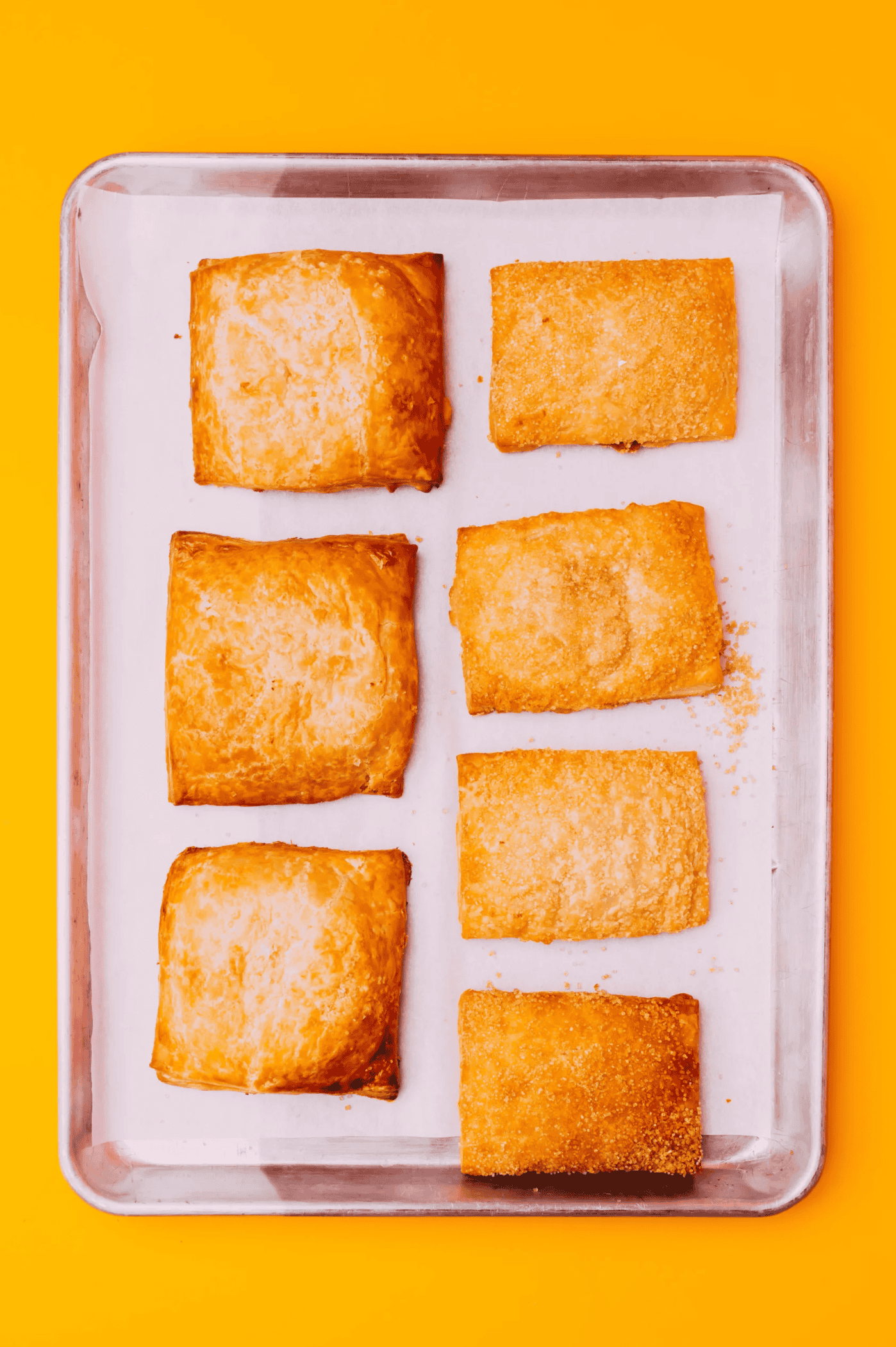
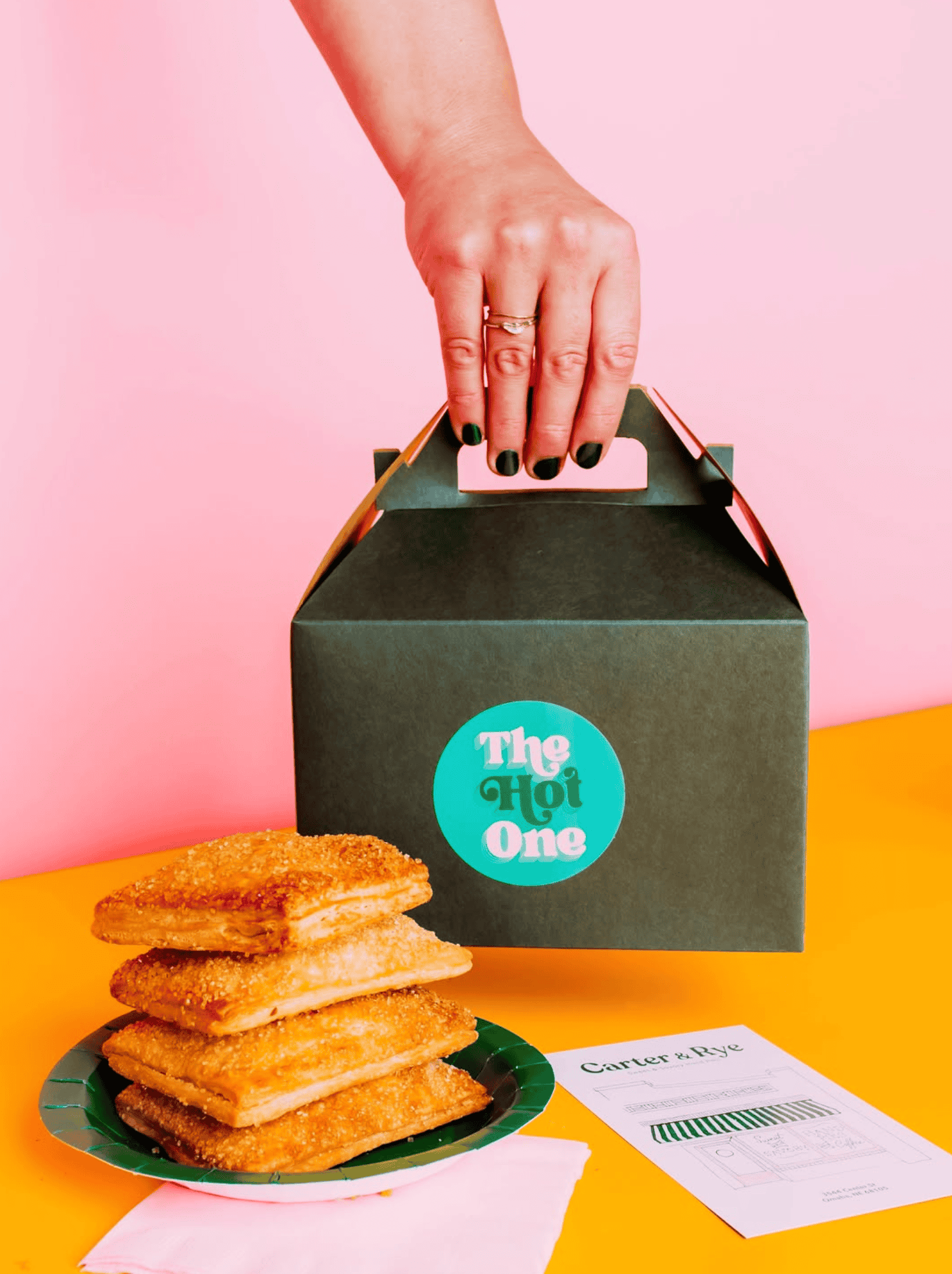
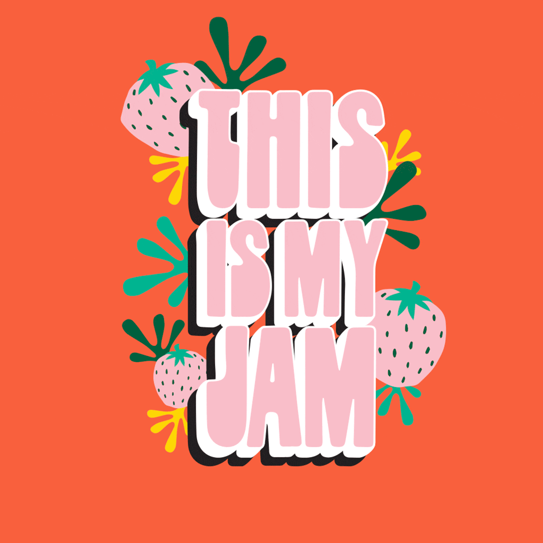
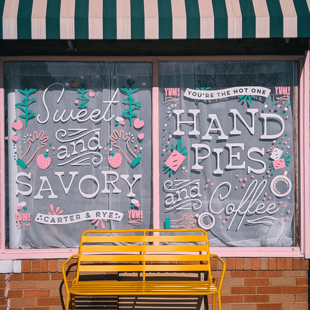
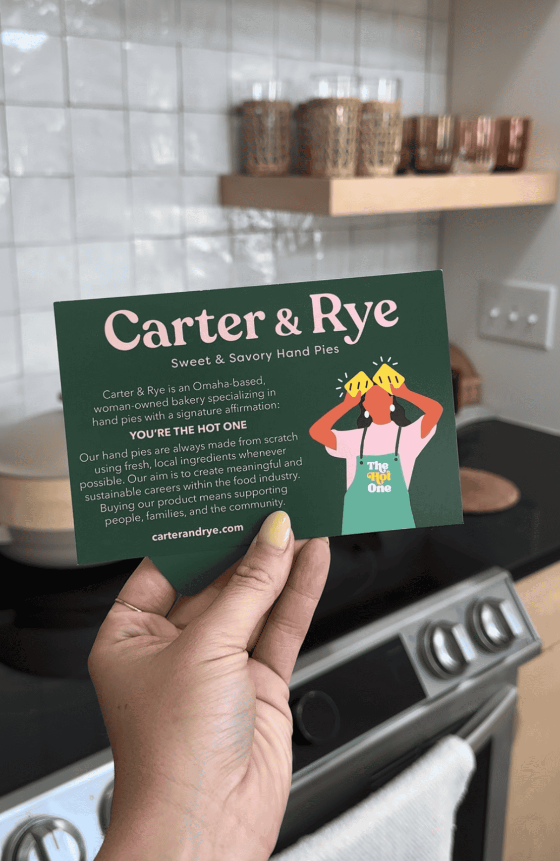
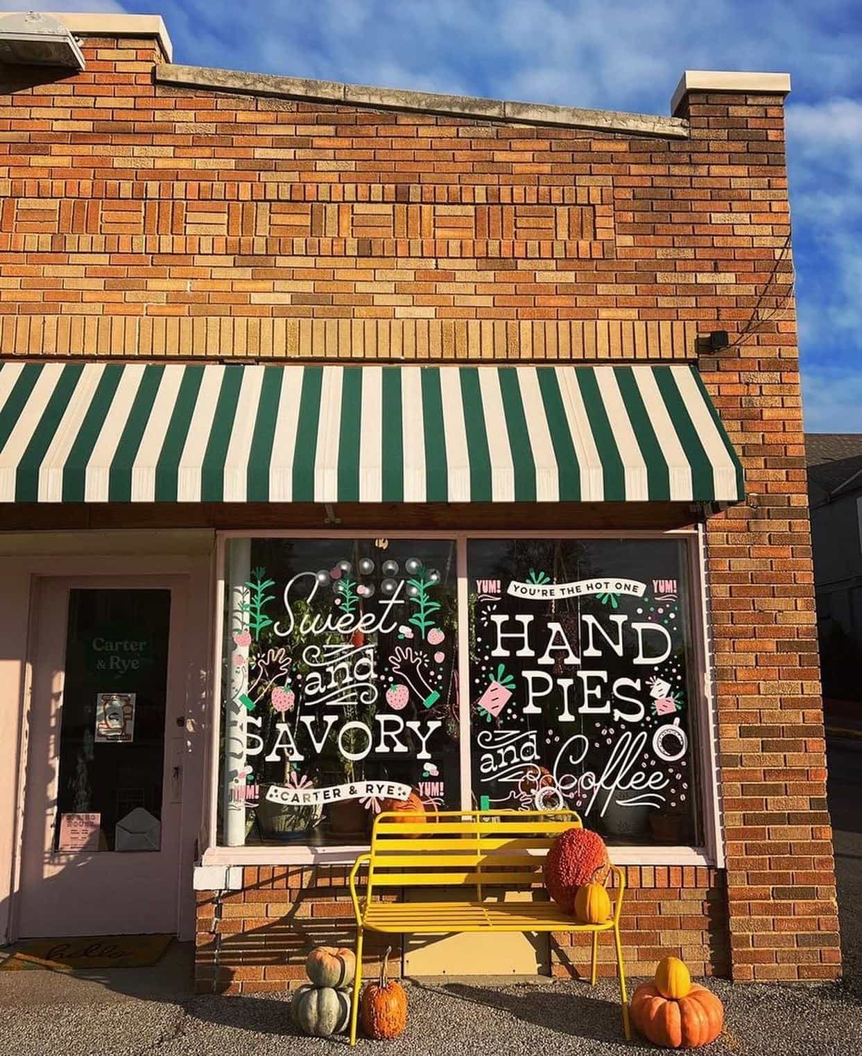
Carter & Rye is a delicious hand pie business located on old Center Street in Omaha! If you've been to one of the farmer's markets, odds are you've seen them slinging pies to community members. Aside from being known for their delectable baked goods, Carter & Rye is also knows for their iconic green and pink branding. I was tasked with creating a brand language that built off of their sole logo mark which would be used for their website, printed materials, merchandise, and packaging. While this leveled up their branding as a whole, their storefront lacked signage making it hard for customers to see when when driving by. Rather than investing in an outdoor sign, I created a full window vinyl wrap using the styles from their brand language to set them apart, and it's one of my favorite before and afters to date! This window display is not only stunning, but it stops you in your tracks and hints at what's waiting for you inside. After nearly three years, this vinyl is sturdy and still looks brand new!
The result?
- Brand consistency across all platforms
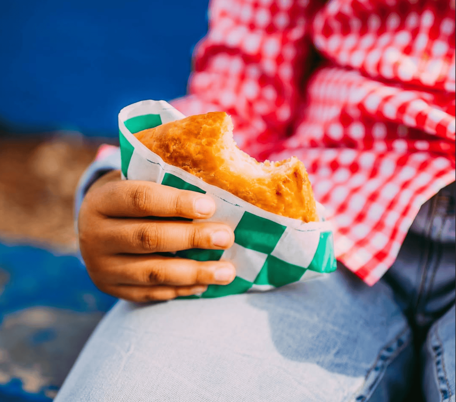
- Leveled up packaging for online and in person orders
- Higher traffic recognition from a busy street
@carterandrye | www.carterandrye.com | Photography by @arielpanowicz
The work


Related Projects
Footlocker's Certified Classics storewide campaign