Packaging Designs That Will Make Your Mouth Water

Need Design Help?
After years of learning what brands need. I'm here to help.
Good Packaging Design Makes the Sale Before You Say a Word

Food packaging design is more than just a pretty bag. It’s the strategy of using materials, color, and typography to protect your product while winning over a shopper in the few seconds you have their attention.
In my experience, great design does a few key things:
- Stops the scroll with bold, intentional visuals that demand a second look
- Tells your brand story at a glance—who you are and what you stand for
- Builds trust through professional presentation and clear, readable information
- Drives the purchase by communicating value before a word is spoken
- Stands out on the shelf when lined up against competitors
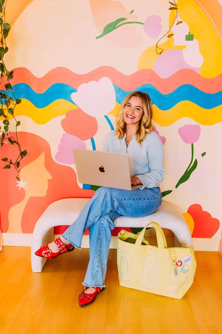
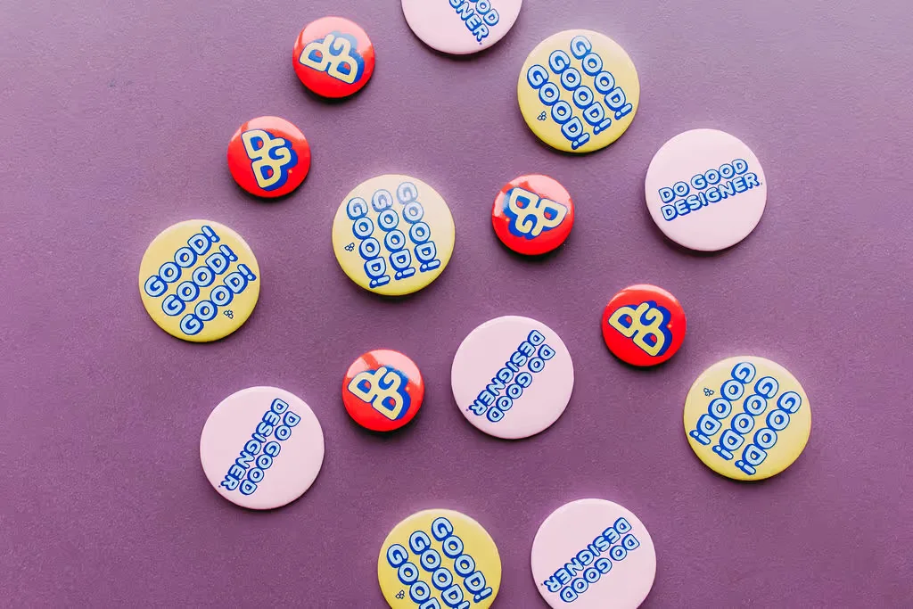
I’m Allie Rapp-Laing, the designer behind The Do Good Designer in Omaha, Nebraska. I’ve spent a decade creating purpose-driven visual identities, including food packaging design for brands that want to stand out and mean something. I believe the world needs less boring packaging, so I’ve rounded up some of the principles that make a product truly shelf-ready.

The Strategy Behind the Shelf
When you’re walking down the aisle of a Hy-Vee or a local Omaha co-op, you aren’t reading every label. You’re scanning for signals. I’ve seen how packaging design impacts purchasing choices - if your design doesn’t land in those first few seconds, you’ve likely lost the sale.
Effective food packaging design relies on a clear visual hierarchy. I organize information so the most important elements - usually the brand name or the flavor - hit the eye first. Whether I’m working with a startup or an established Midwest brand, my goal is to create a shelf-ready strategy that feels authentic to the maker but professional enough to compete with national names.
Good design isn’t decoration, it’s strategy. A package has to do a lot of jobs at once: catch attention, communicate what the product is, reflect the brand’s personality, and make the customer feel confident enough to buy. If any one of those pieces is missing, the package has to work harder than it should.
I also think the best packaging feels honest. If the product is playful, the design should be playful. If it’s elevated and premium, the design should carry that same confidence. Shoppers can tell when something feels generic, and that disconnect can make even a great product look forgettable.
Typography as Your Brand’s Voice
Typography is how you "speak" to a customer from across the room. I’m a huge fan of vintage-inspired fonts and custom lettering because they add a layer of personality that a standard system font just can't touch.
Typography as a brand's voice can lean artisanal for a gourmet jam or punchy for a new snack line. The key is balance. You want character, but it has to be readable. If a customer has to squint to figure out the ingredients, the design has failed. I use wide spacing and unique alignments to give the text room to breathe, ensuring the product name pops.
I pay close attention to how type works at different distances. From six feet away, a shopper should understand the main message immediately. Up close, the smaller details should still feel intentional and easy to read. That mix of personality and function is what makes typography feel like part of the brand rather than just text placed on a label.
Color and Sustainability
Color is the first thing the eye registers. I use color psychology to trigger specific cravings or perceptions. Red can stimulate appetite, while green signals something fresh or plant-based. I choose palettes that don't just look pretty on a screen - because color matters - but actually move the needle on the shelf.
Color also helps position a product. A bright, unexpected palette can make a playful snack feel energetic and modern, while a more restrained palette can make a specialty item feel refined. I’m always thinking about how a product needs to be perceived before I ever start decorating the surface.
I also believe sustainability is a core design requirement. Modern shoppers care about what happens to the box after the food is gone. We’re seeing a shift toward compostable wrappers and recyclable materials. Designing for sustainability means thinking about the entire lifecycle of the package - it’s about the "conscience" of the brand.
For me, that also means designing with intention instead of excess. A package doesn’t need to be overbuilt to feel special. Sometimes the smartest solution is the one that communicates clearly, uses materials responsibly, and still gives the brand a strong point of view.
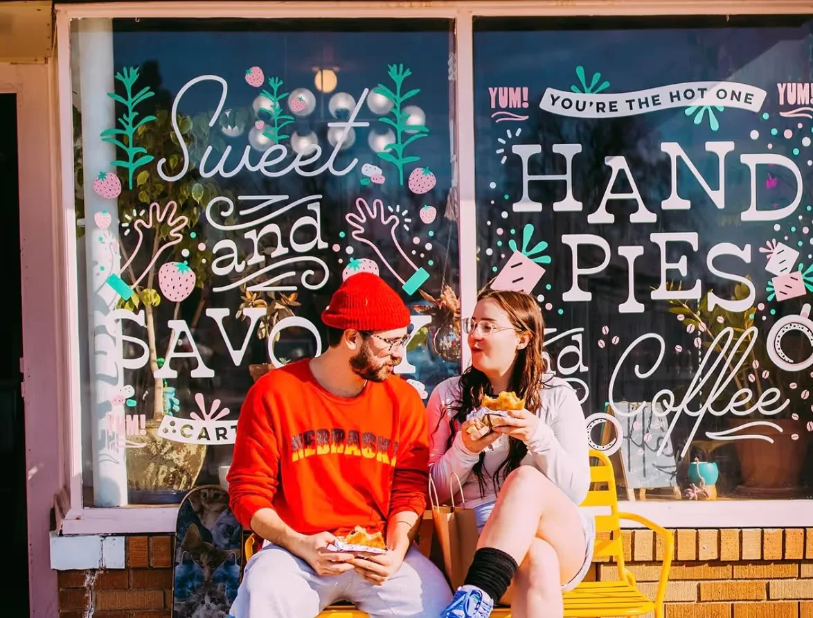
Inspiration Across the Grocery Aisle
Inspiration is everywhere, from the chocolate section to the dairy case. The best designs are the ones that know when to break the rules. While most dairy brands stick to blues and whites, a brand using bold, unexpected illustrations will immediately grab attention.
I’m constantly noticing what makes me pause when I shop. Sometimes it’s a fearless color choice. Sometimes it’s a tiny detail in the lettering or a label layout that feels unusually confident. Those moments are a reminder that effective food packaging design is rarely about doing more - it’s about making sharper, more intentional choices.
Different categories teach different lessons. Chocolate packaging often gets to be emotional and expressive. Snack packaging usually has to be quick and loud in the best way. Prepared foods need clarity and appetite appeal. Looking across the aisle helps me see where a brand should fit in and where it has an opportunity to stand apart.
Human-Centric Design
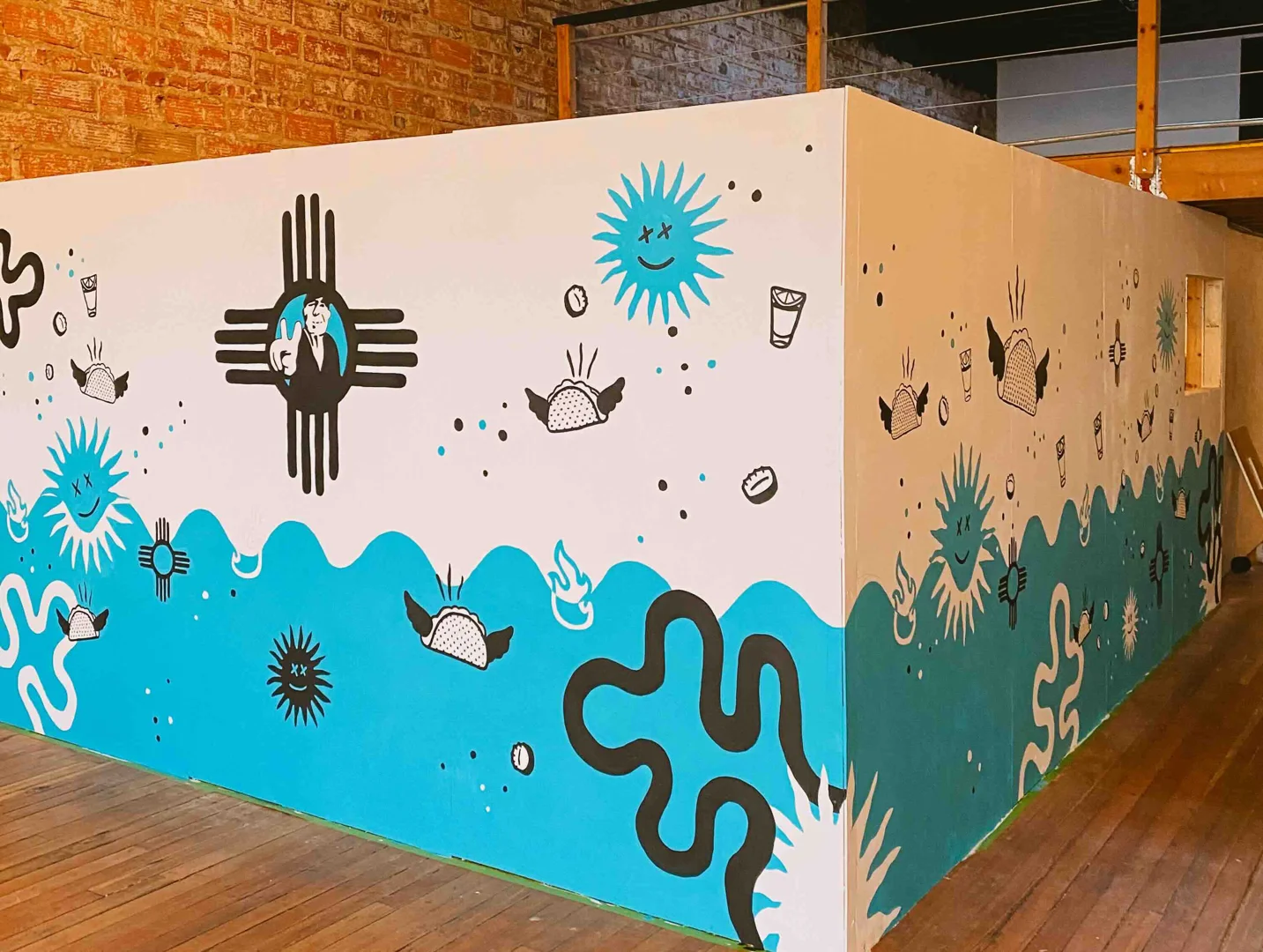
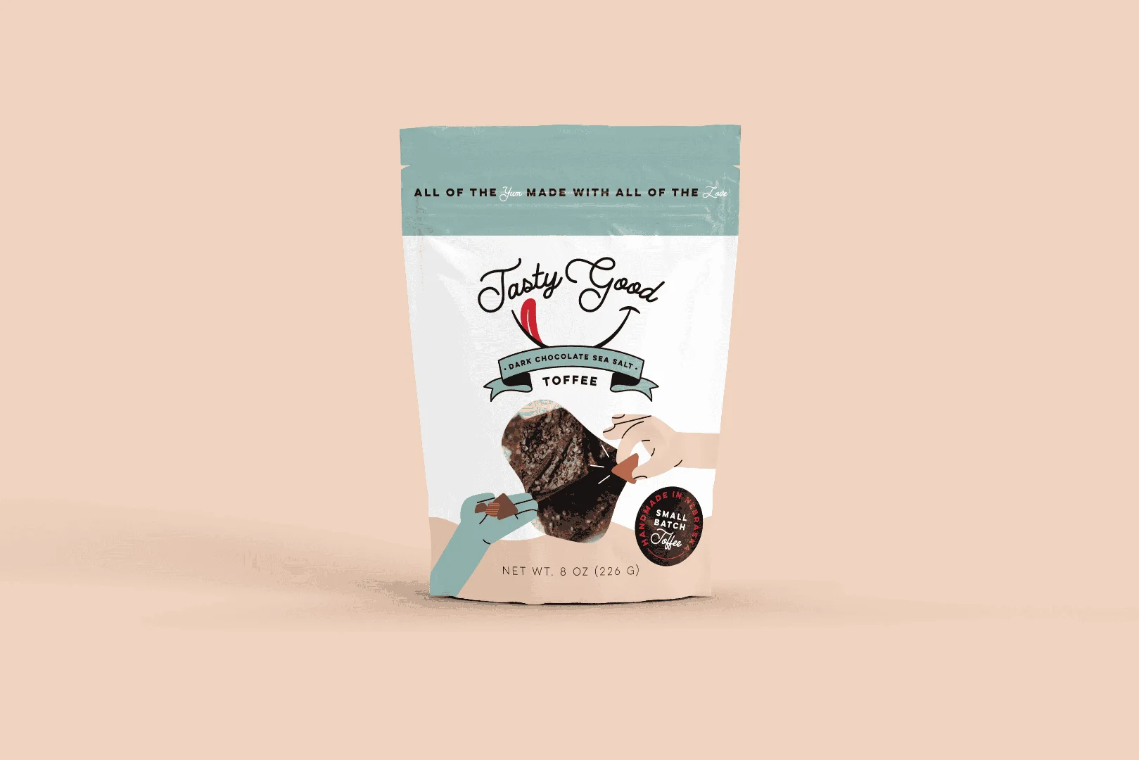
There is something powerful about a hand-drawn illustration. In a world of AI-generated perfection, a sketch conveys authenticity and a "maker" spirit. I’ve seen this work beautifully in pasta packaging, where illustrations turn the product itself into part of the art. I took a similar approach when bringing new life to a family recipe, using visual elements that honored the history of the food while making it feel modern.
That human touch matters, especially for small brands trying to communicate care and craft. An illustration can make a package feel warm, local, and rooted in a real story. When it’s done well, it doesn’t just make the product look nice - it gives the customer a reason to feel connected to the people behind it.
Minimalist labels can also have a massive impact. When a brand is confident enough to let its name sit on a clean background, it tells the consumer the product is high quality. Since so many purchasing decisions happen at the shelf, clarity is king. Minimalism isn't boring; it's intentional.
The biggest mistake I see with minimal packaging is confusing simplicity with emptiness. Strong minimalist design still needs hierarchy, contrast, and personality. It should feel edited, not unfinished. When every element earns its place, the result can feel premium, modern, and incredibly memorable.
Designing for the Midwest Small Business
As a designer in Omaha, I have a soft spot for our local food scene. Whether it’s a bakery in Benson or a coffee roaster in the Old Market, Midwest brands have a unique blend of grit and heart. My work at The Do Good Designer is all about helping these businesses find their visual voice.
A lot of small businesses have amazing products but packaging that hasn’t caught up yet. Maybe the food is great, but the label feels homemade in a way that doesn’t support the price point. Maybe the branding started as a quick solution and now the business is ready for something that actually reflects the quality of what’s inside. That’s where strategic design makes a real difference.
From creating a bold and doughy branding system to designing labels that tell a story, I’m here to make sure your hard work gets noticed. If you’re a purpose-driven brand ready to move from a generic pouch to a retail-ready package, work with me to elevate your food packaging design. Let’s make something that looks as good as it tastes.