Brand Identity vs Logo: Clearing the Confusion

Need Design Help?
After years of learning what brands need. I'm here to help.
Why Your Business Needs More Than Just a Logo
What is a brand identity? It's the full system of visual and verbal elements a business uses to show up in the world — not just a logo, but everything that shapes how people recognize and feel about you.
Here's what that system includes:
- Logo — the mark or wordmark that anchors your visual identity, along with all brand mark variations
- Color palette — the specific colors used consistently across every touchpoint including print, digital, and Pantones
- Typography — the fonts and typefaces that set your brand's tone, along with usage cases for each
- Imagery style — the look and feel of photos, illustrations, or graphics you use
- Graphical elements — shapes, patterns, icons, or textures that reinforce recognition
- Brand voice — how you write and speak to your audience
- Tagline — a short phrase that communicates your positioning
Together, these elements create something much bigger than any single piece. That's brand identity.
A lot of business owners think a logo is their brand. I get it — it's the most visible part. But a logo without a supporting system is like a storefront with no interior. It might get someone to the door, but it won't keep them there. It also could cause you extra stress as a business owner with struggling to create marketing materials, social media graphics, and keeping eveything consistent.
Your brand identity is what makes someone recognize you on a shelf, trust you on a website, and remember you after the meeting ends. It's the difference between looking like a real business and being one.
I'm Allie Rapp-Laing, the designer behind The Do Good Designer, and understanding what is a brand identity — and how it works as a system — is the foundation of almost every project I take on, from logo design for Omaha small businesses to full visual identity systems for national brands. Let's break it all down so you know exactly what you're working with.

What is a brand identity and why does it matter?
When I talk to business owners in Omaha or across the Midwest, some ask me to "just design a logo." But once we start talking about their goals, they realize they need a way to connect with people. That connection is fueled by your brand identity.
Think of brand identity as the "tinted glasses" through which your customers see your business. It colors their perception of your quality, your values, and your price point. If your visuals look cheap or disconnected, people will assume your product is, too. But when your identity is intentional, it acts as a strategic asset that creates a barrier against your competition.
Design isn't just about making things look "cool." It’s about that first impression. In fact, research shows that 94 percent of first impressions are design-related. If your website or packaging doesn't look professional, you've lost the customer before they’ve even read a single word of your copy.
For a purpose-driven business, a strong identity is how you prove you're the real deal. It’s what allows you to charge premium prices and build a community of people who don't just buy from you—they advocate for you.
The Difference Between Branding, Identity, and Image
These terms get thrown around like they’re the same thing, but they aren't. Understanding the difference helps you know what you can control and what you can't.
- Branding is the action. It’s the marketing practice of actively shaping your brand. It’s the work we do together to influence how people see you.
- Brand Identity is the toolset. It’s the tangible stuff I create for you—the logo, the colors, the fonts, and the branding projects that make your business recognizable. It is the "input."
- Brand Image is the result. It’s the actual perception in the customer's mind. You can’t 100% control this, but you can influence it heavily by having a rock-solid identity.
I like to use a middle school analogy. If you wanted to be seen as the "cool kid" (Brand Image), you might start playing basketball and listening to specific music (Branding). Your haircut, your shoes, and the stickers on your notebook? That’s your Brand Identity. It’s the visual proof of who you are.
Core Elements: What is a brand identity made of?
A great identity is a puzzle where every piece fits perfectly. If one piece is missing or from a different puzzle, the whole thing feels "off." When I work on Logo Design & Brandings services, I focus on these core building blocks:
1. Logo Systems A single logo isn't enough anymore. You need a system. It needs to work on a giant mural in downtown Omaha just as well as it works on a tiny Instagram profile picture. This includes:
- Primary logo: The main mark that anchors your brand.
- Secondary mark: A variation for smaller or different spaces.
- Submark or favicon: Simplified versions for social media or browser tabs.
2. Color Palette Colors aren't just about what looks pretty. They carry psychological weight. A strategic palette gives you a "dominant hue" to own in your market. For example:
- Blue can signal trust and reliability.
- Bold oranges or reds might signal energy and excitement.
3. Typography and Typefaces The fonts you choose speak volumes before anyone reads the words. There is a technical difference between a font and a typeface, but what matters most for your brand is that they are legible and consistent. Consider the tone:
- Serif fonts often feel traditional and reliable.
- Sans-serif fonts feel modern and approachable.
4. Brand Voice and Messaging How do you talk? Are you witty and fun, or professional and calm? Your brand identity includes the "tone" of your copy. This voice needs to match your visuals. If your logo is bright and bubbly but your emails are stiff and corporate, customers will feel a disconnect.
5. Imagery and Graphical Elements This is the "texture" of your brand. It includes the style of photography you use, custom patterns, or icons. These elements tie everything together, especially on social media or in packaging design.
How a Strong Identity Drives Real Results
I don't make things just to make things. I design for results. A cohesive brand identity isn't just a "nice to have"—it’s a revenue driver. Research indicates that consistent branding can increase revenue by 10 to 20 percent.
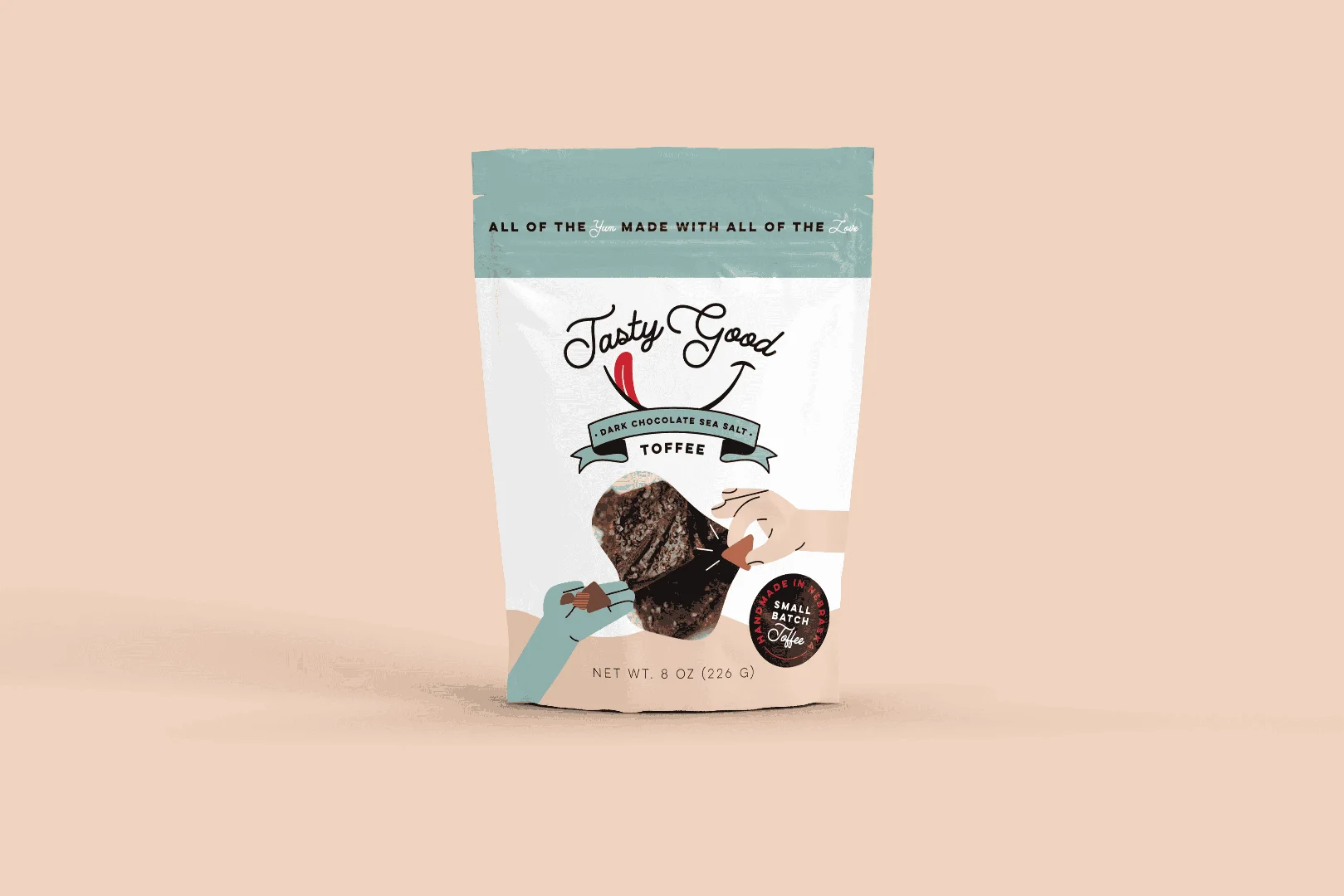
When your branding is consistent, you build trust. Trust leads to loyalty, and loyalty leads to a higher "brand equity." This means your business becomes more valuable over time. Look at A Brand System with Iconic Style—it’s not just about the logo; it’s about a look that creates a professional, high-end feel that justifies a higher price point.
A strong identity also helps you:
- Attract Talent: 36% of employees say a company's reputation and brand are very important when looking for a job.
- Simplify Decisions: In a crowded market, people grab the brand they recognize.
- Create Resilience: When you have a loyal following, you can weather market shifts or price changes more easily than a business with no identity.
Building a Brand That Lasts
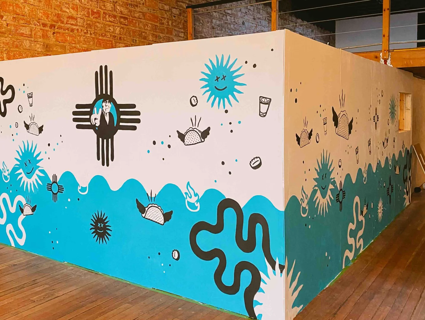
I’m a firm believer the world needs less boring walls and fewer generic brands. Building a brand that lasts means choosing longevity over trends. We’ve all seen the "trendy" designs that look dated six months later. I prefer to create something that feels timeless but bold.
Whether I'm painting a mural for a local shop or designing a visual system for a new small business, the goal is the same: intentionality. You want an identity that grows with you. According to the Harvard Business Review, a successful brand refresh or identity build should stay true to your essence while adapting to the modern market.
The Process: What is a brand identity discovery?
I don't start by drawing. I start by listening. The "Discovery" phase is where we find the heart of your business. We look at:
- Your Mission and Values: Why did you start this? What do you believe in?
- Your Audience: Who are we talking to? What are their pain points?
- The Competition: What is everyone else doing, and how can we do the opposite?
Using tools like a personal brand workbook or stakeholder interviews helps us define your "Customer Value Proposition." I love projects like A Midcentury Modern Brand for a Roaming Coffee Trailer because the identity was born directly from the owner's vision and the unique vibe of their business.
Maintaining Consistency with Brand Guidelines
Once the design is done, the real work begins: keeping it consistent. This is where "Brand Guidelines" (or a Style Guide) come in. This document is the rulebook for your brand. It tells you exactly how to use your logo, which fonts to use for your website, and what colors are allowed.
Without guidelines, your brand can go "feral." One person uses the wrong red, another uses a weird font on a flyer, and suddenly your professional image is gone. Large companies like E.ON use digital brand guidelines to keep thousands of employees on the same page. For a small business, a simple PDF guide is usually enough to ensure that every touchpoint—from your business cards to your Bold and Doughy Branding—looks exactly the way it should.
When to Refresh vs. Rebrand
Your brand identity isn't set in stone. It should evolve as your business grows. On average, companies rebrand every 7-10 years.
But how do you know if you need a "refresh" or a full "rebrand"?
- A Brand Refresh is like a new coat of paint. We might modernize your logo, update your color palette, or tweak your fonts. You keep your core recognition but look more current.
- A Rebrand is a total overhaul. This usually happens if your business model changes, you’re trying to reach a completely different audience, or your current identity is holding you back from growth.
If you feel like your current look doesn't reflect the quality of what you do, it might be time to view all design services and see how we can level things up.
Good design isn't decoration; it's strategy. Whether you're a coffee shop in Omaha or a national product brand, your identity is your most valuable asset. It tells the world who you are and why you matter. Don't settle for "just a logo" when you could have a brand that actually does some good.